The Psychology of Color – Can You Color Your Way to Success?
Human beings are visual creatures.
Half of the human brain is involved – directly or indirectly – in processing information from the eye.
The brain’s so fast when it comes to handling visual cues, that it takes approximately 13 milliseconds for an image to be understood.
And it doesn’t take much longer than that for color to make its full impact – on your mood, your reasoning, and even your decision-making ability.
The psychology of colors is very much real.
And top-notch marketers and branding strategists are well aware of it.
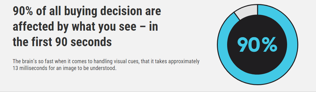
Actually, around 90% of all buying decision are affected by what you see – in the first 90 seconds. No wonder the world’s bombarded with visual ads full of carefully picked colors.
But are things always as black and white? (pun intended)
Is red always going to bring you more sales than green – or is it the context in which red is used that gives it its superiority?
Well, let’s find out.
Psychology of color simplified
If invited to a baby shower, most people would walk into a store and choose pink for girls and blue for boys – with the very best intentions in mind.
And yet, some may find this offensive.
But the ‘pink is for girls and blue is for boys’ has almost nothing to do with gender stereotypes.
It has everything to do with a classic example of the psychology of color into action.
That idea only got ingrained in everyone’s minds after the 1950s – and the popularity of French fashion may be to blame. Before the 1950s, pink was for boys (it was seen as a stronger, more dominant color) and blue was for girls (as a gentler, more delicate shade).
That story just goes on to prove how powerful marketing campaigns can get – of course, when paired with the right color.
Colors in the world of marketing & branding
Your brain was trained to recognize pink as a girl’s color the same way it’s been trained to recognize McDonald’s red-and-yellow sign.
And apparently, red is a favorite of many as it’s very attention-grabbing. HubSpot noticed an increase of 21% in their sales just by switching their CTA button from GREEN to RED.
But same as the fact that not every girl would choose pink over blue, strong colors like red aren’t always the solution.
Using vibrant red and yellow to promote an organic plant-based food deli is never going to work, simply because the message of the red isn’t aligned with the message of the deli.
To choose the right color for your business, you first have to know a few things about color symbolism – or in short, the meaning behind colors.
Here’s a short overview of color meaning
It’s obvious that the right color, paired with the right brand’s message, can do wonders for your business.
Before you start branding – or rebranding – your business, here’s how different colors may be perceived.
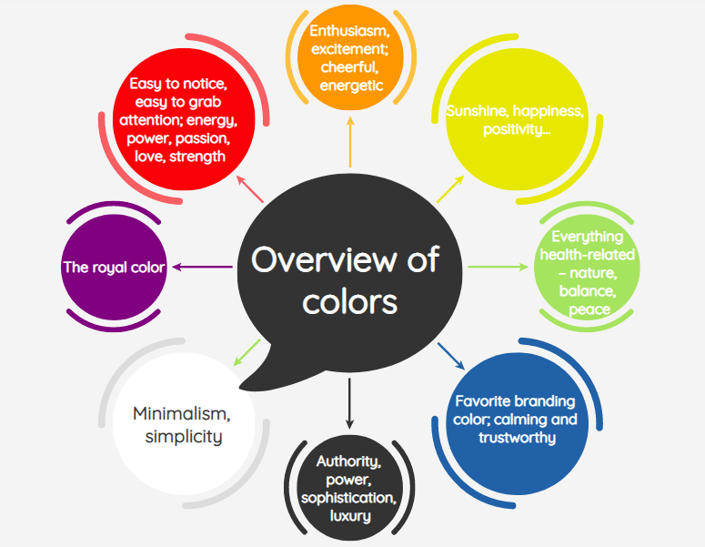
- Red
Easy to notice, easy to grab attention; energy, power, passion, love, strength – but also associated with danger! Great at triggering emotions; it might increase appetite; it might support the feeling of urgency (remember the flashy red SALE signs?)
- Orange
Enthusiasm, excitement; cheerful, energetic – but also, may trigger anxiety; associated with affordable but also, cheap (used to target impulsive buyers)
- Yellow
Sunshine, happiness, positivity… the emoji color, never-ending fun – but difficult to pair with and may strain the eye if not paired correctly (white letters on a yellow surface – yikes!)
- Green
Everything health-related – nature, balance, peace – but the wrong shade may remind people of money, finances, or the military
- Blue
Favorite branding color; calming and trustworthy – associated with loyalty, maturity, tradition; might be too difficult to stand out using blue
- Purple
The royal color – wisdom, wealth, maturity, luxury – but also, moodiness, sadness
- Black
Authority, power, sophistication, luxury – excellent choice for high-end products and packaging; but also too dark, too heavy – associated with sadness and death
- White
Minimalism, simplicity – used to send a message of honesty and safety; a great choice to pair up with almost any other color
Only ONE color to rule them all?
The myth that there’s only one color to rule them all is just that – a myth.
Choosing a strong color – like red or black – isn’t always a guarantee for success.
A study showed that people perceive colors based on a variety of different factors– cultural, social, religious, to name a few.
While white is the color of sorrow in the Muslim world, it signifies joy and new beginnings (wedding bells!) in the Western world.
Even personal preferences play a hand. You can’t always fit people in boxes. It’s not like you can make someone love a color if they already don’t, can you?
Context matters the most!
Red isn’t always more superior than green – or vice versa.
The context in which red or green or any other color is used is what the psychology of color in marketing and brandingis all about.
Look at Starbucks or look at Pandora. They’ve done wonders using calmer, subtler tones in their visual branding.
And why was that the winning combo?
Well, again, simply because the context in which they’d used a particular color was right for their target audience.
Golden rules to follow for YOUR business
Choosing the right color for your website or packaging won’t always be simple.
But there are a few golden rules that will probably come in handy when applying psychology of color in your own marketing and branding campaigns.
1. The right feeling over the right color
One of the biggest appeals of color is its ability to evoke a particular feeling in you within seconds. (it’s why sandy beaches and deep blue seas make for fantastic desktop backgrounds and muddy fields do not)
So instead of focusing the search on the ultimate color for your brand, focus on the right feeling.
Imagine your ideal customer as detailed as possible. What do you want them to feel when engaging with your brand? That’s the right color for you!
2. Color preferences by gender don’t always matter
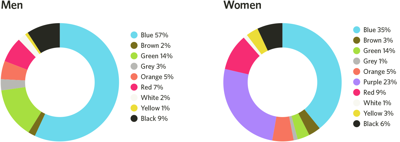
When it comes to favorite colors, a study found that yes, there are differences between color preferences in men and women.
But they’re not always as stereotypical as ‘pink is for girls and blue is for boys’. Blue is the absolute favorite – and seems like orange and brown are both equally disliked by everyone.
Then again, the perception of color can be subjective. You know your customer best – how are they likely to feel about a particular color?
Pro tip: This is where A/B testing does wonders. You don’t have to figure it out yourself – let data figure it out for you.
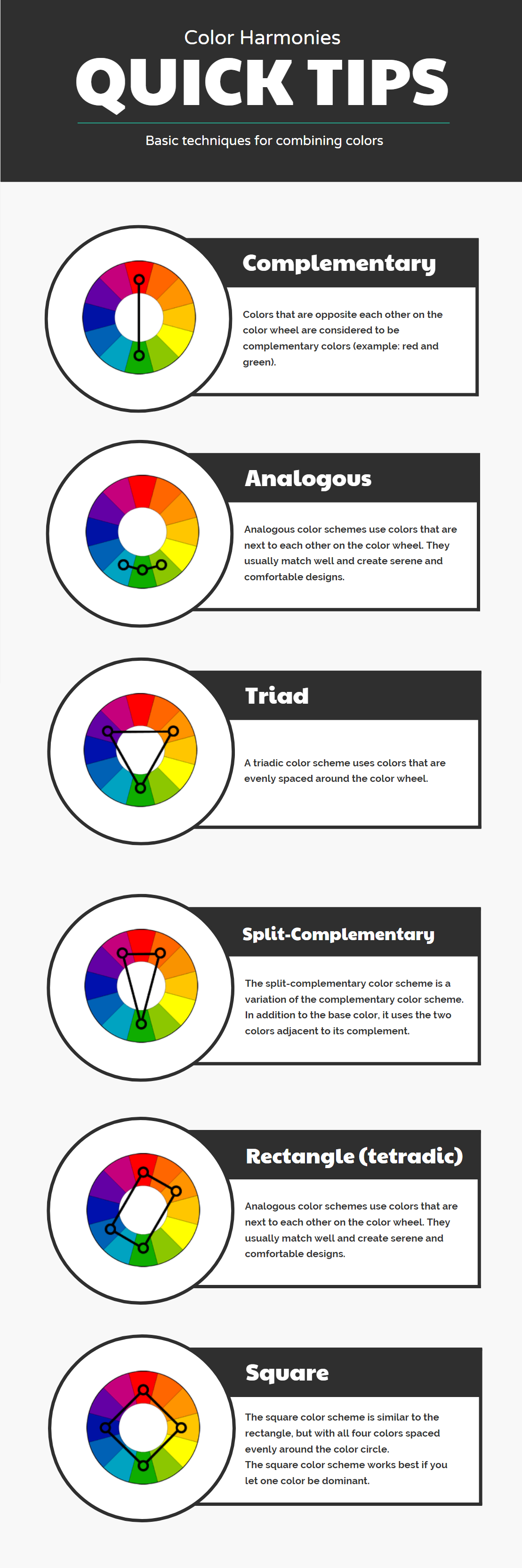
3. The Holy Triadic of color
There are several different techniques to combine colors in your branding but the one that seems the most promising is the triadic color scheme.
The big secret here is to use the all-mighty color wheel to make your pick. Choose colors that are evenly spaced out on the wheel – for example, green, purple, orange.
Most of the time, you can’t go wrong with the triadic color circle – no matter the colors you include.
Wrapping it up
While there’s not one ultimate color in marketing & branding or advertising, you may be able to achieve better results with the right colors for your brand.
Choose your color(s) based on:
- The feelings you want customers to have when interacting with your brand
- The way that color aligns and reinforces your brand’s message
What color are you going to choose and why?